Categories
Software releases

Software to Generate IP Hitlists with Hadoop Now Available

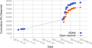
We are happy to release the set of map/reduce processing scripts that run in Hadoop to consume our Internet address censuses and output hitlists, as described in the paper “Selecting Representative IP Addresses for Internet Topology Studies“.

These scripts depend on our internal Hadoop configuration and so will require some modification to work elsewhere, but we make them available and encourage feedback about their use.

Categories
Presentations

new talk “Long-term Data Collection and Analysis of Outages at the Edge” given at the AIMS workshop

John Heidemann gave the talk “Long-term Data Collection and Analysis of Outages at the Edge” at UCSD, San Diego, California on Feb. 8, 2013 as part of the CAIDA Active Internet Measurement Systems (AIMS) Workshop.  Slides are available at http://www.isi.edu/~johnh/PAPERS/Heidemann13e.html.

talk_icon

This talk describes our analysis of outages in edge networks at the time of Hurricane Sandy, and how that work was enabled by long-term data collection. The analysis showed U.S. networks had double the outage rate (from 0.2% to 0.4%) on 2012-10-30, the day after Sandy landfall, and recovered after four days. We highlighted long-term data collection of Internet Surveys, a random sample of about 41,000 /24 blocks, and the characteristics that make that data suitable for re-analysis. The talk was part of the CAIDA Workshop on Active Internet Measurement Systems, hosted at UCSD.

This work is based on our recent technical report   “A Preliminary Analysis of Network Outages During Hurricane Sandy“, joint work of John Heidemann, Lin Quan, and Yuri Pradkin.

Categories
Presentations

new abstract “Third-Party Measurement of Network Outages in Hurricane Sandy” and talk with video at FCC Workshop on Network Resiliency

We recently posted our abstract “Third-Party Measurement of Network Outages in Hurricane Sandy” at http://www.isi.edu/~johnh/PAPERS/Heidemann13c.html and the talk “Active Probing of Edge Networks: Hurricane Sandy and Beyond” at http://www.isi.edu/~johnh/PAPERS/Heidemann13d.html

These were part of the FCC Workshop on Network Resiliency at Brooklyn Law College, Brooklyn, NY on Feb. 6, 2013, chaired by Henning Schulzrinne.

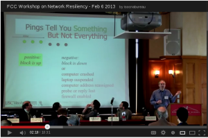
Video from our talk and for the whole workshop is on YouTube.

fcc_youtube

A summary of the talk:

This talk summarized our analysis of outages in edge networks at the time of Hurricane Sandy. This analysis showed U.S. networks had double the outage rate (from 0.2% to 0.4%) on 2012-10-30, the day after Sandy landfall, and recovered after four days. It also describes our goal of tracking all outages in the Internet. The talk was part of the FCC workshop on Network Resiliency, hosted at Brooklyn Law College by Henning Schulzrinne.

This work is based on our recent technical report   “A Preliminary Analysis of Network Outages During Hurricane Sandy“, joint work of John Heidemann, Lin Quan, and Yuri Pradkin.


Categories
Presentations

new talk “Active Probing of Edge Networks: Outages During Hurricane Sandy” at NANOG57

John Heidemann gave the talk “Active Probing of Edge Networks: Outages During Hurricane Sandy” at NANOG57 in Orlando Florida on Feb. 5, 2013 as part of a panel on Hurricane Sandy, hosted by James Cowie at Renesys.  Slides are available at http://www.isi.edu/~johnh/PAPERS/Heidemann13b.html.

m2051752.small

This talk summarizes our analysis of outages in edge networks at the time of Hurricane Sandy. This analysis showed U.S. networks had double the outage rate (from 0.2% to 0.4%) on 2012-10-30, the day after Sandy landfall, and recovered after four days. The talk was part of the panel “Internet Impacts of Hurricane Sandy”, moderated by James Cowie, with presentations by John Heidemann, USC/Information Sciences Institute; Emile Aben, RIPE NCC; Patrick Gilmore, Akamai; Doug Madory, Renesys.

This work is based on our recent technical report   “A Preliminary Analysis of Network Outages During Hurricane Sandy“, joint work of John Heidemann, Lin Quan, and Yuri Pradkin.


Categories
Publications Technical Report

new tech report “A Preliminary Analysis of Network Outages During Hurricane Sandy”

We just released a new technical report “A Preliminary Analysis of Network Outages During Hurricane Sandy”, available at ftp://ftp.isi.edu/isi-pubs/tr-685.pdf and at http://www.isi.edu/~johnh/PAPERS/Heidemann12d.pdf.

From the abstract:

This document describes our analysis of Internet outages during the October 2012 Hurricane Sandy. We assess network reliability by pinging a sample of networks and observing those that respond and then stop responding. While there are always occasional network outages, we see that the outage rate in U.S. networks doubled when the hurricane made landfall, then took about four days to recover. We confirm that this increase was due to outages in New York and New Jersey.

Categories
Announcements

ANT project blog moved

The ANT Project blog has moved from http://www.isi.edu/ant/blog to it’s new location at http://ant.isi.edu/blog/

If you’re watching the blog via RSS, you may want to update your feedreader.

Categories
Announcements

IP Geolocation in our Browsable IPv4 Map

We’re happy to announce that our browsable Internet map at http://www.isi.edu/ant/address/browse/ now includes IP geolocation.

We plot the latitude and longitude of each IP address around the world as a specific color, placing them on our IPv4 map (the zoomable Hilbert curve).  Thus we can show how blocks of IPv4 addresses map (above) to the globe (below).

AMITE Geolocation of IPv4 as of 2012-06-28
Hue and lightness to longitude and latitude.

On the IP map, we show latitude/longitude by color.  For each address, the longitude is the hue (the colors around the rainbow), so North America is blue; South America, fuschia; Europe and Africa, red; and Asia to Australia yellow to green.  The latitude controls lightness, so things north of the equator are darker, while those south of the equator are lighter. Thus Japan is dark green, while Australia is teal, and Scandanavia is dark read, while south Africa is orange.  (We have released the source code to do this mapping with a BSD license.)

The IP map shows IP all 4 billion addresses on the Hilbert curve.  We have discussed this mapping before (see our poster).

Our IP map is zoomable and draggable, so one can look at particular regions of interest.  For example, here is 128/8, including ISI (in Los Angeles, dark blue), between UC San Diego (also dark blue) and University of Maryland (US east coast, so purple), while the Fininnish University of Helsinki is dark brown, and the Australian University of Melboure is lime green.

Annotated IPv4 geolocation

Our geolocation data comes from three sources:

All of these geolocation sources have varying levels of accuracy, however we hope that the ability to visually relate IP addresses (onthe Hilbert curve) with geolocation (via latitude and longitude as shownby color) provides a fresh look at IP addresses and their locations.

This geolocation work is due to Zi Hu, Yuri Pradkin, and John Heideman.  This work and visualization has been supported by the AMITE project through DHS, and the data (both processed geolocation results and raw data if you can improve our accuracy) will be available through the LANDER project’s datasets and the PREDICT program.


Categories
Papers Publications

new conference paper “Low-Rate, Flow-Level Periodicity Detection” at Global Internet 2011

Visualization of low-rate periodicity, before and after installation of a keylogger.  [Bartlett11a, figure 3]
Visualization of low-rate periodicity, before and after installation of a keylogger. [Bartlett11a, figure 3]
The paper “Low-Rate, Flow-Level Periodicity Detection”, by Genevieve Bartlett, John Heidemann, and Christos Papadopoulos is being presented at IEEE Global Internet 2011 in Shanghai, China this week. The full text is available at http://www.isi.edu/~johnh/PAPERS/Bartlett11a.pdf.

The abstract summarizes the work:

As desktops and servers become more complicated, they employ an increasing amount of automatic, non-user initiated communication. Such communication can be good (OS updates, RSS feed readers, and mail polling), bad (keyloggers, spyware, and botnet command-and-control), or ugly (adware or unauthorized peer-to-peer applications). Communication in these applications is often regular, but with very long periods, ranging from minutes to hours. This infrequent communication and the complexity of today’s systems makes these applications difficult for users to detect and diagnose. In this paper we present a new approach to identify low-rate periodic network traffic and changes in such regular communication. We employ signal-processing techniques, using discrete wavelets implemented as a fully decomposed, iterated filter bank. This approach not only detects low-rate periodicities, but also identifies approximate times when traffic changed. We implement a self-surveillance application that externally identifies changes to a user’s machine, such as interruption of periodic software updates, or an installation of a keylogger.

The datasets used in this paper are available on request, and through PREDICT.

An expanded version of the paper is available as a technical report “Using low-rate flow periodicities in anomaly detection” by Bartlett, Heidemann and Papadopoulos. Technical Report ISI-TR-661, USC/Information Sciences Institute, Jul 2009. http://www.isi.edu/~johnh/PAPERS/Bartlett09a.pdf

Categories
Presentations

New Video About Address Utilization and Allocations on Map Browser

The ANT project released a video describing Internet address allocation and how we study address utilization with IPv4 censuses. Aniruddh Rao prepared this video, working with John Heidemann and Xue Cai.

a scene from the ANT video describing address allocation and census taking

We have also updated our web-based IPv4 address browser to provide information about to what organizations each address block is allocated. The map now visualizes the whois allocation data; we thank the five regional internet registries for sharing this data with us and authorizing this visualization.

organizations in our Internet map

Finally, our web-based IPv4 address browser now has better time travel, with nearly 30 different census from Dec. 2005 to Nov. 2010, and we continue to update the map regularly.

Data collection for this work is through the LANDER project, and the map browser improvements are due to AMITE, both supported by DHS. Video preparation was supported by these projects and NSF through the MADCAT project.

Categories
Announcements

multiple views in browsable Internet address map

We’re happy to announce an update to our browsable Internet map at http://www.isi.edu/ant/address/browse/. Our map now includes FIND ME and MULTIPLE VIEWS.

screenshot of browsing RTTs in the Internet

FIND ME: To locate any host on the map, click in the IP address address box (at the top right) and type in a hostname. A pushpin will appear at that address, with a bubble indicating the hostname and IP address, and the map will scroll to the location. No more manually finding addresses!

MULTIPLE VIEWS allow users to flip between different data types, census dates, source locations:

  1. DATA TYPES: We now plot round-trip times in addition to prior ping responsiveness. See how far away the Internet is! (At least from our probing sites.)
  2. CENSUS DATES: We currently plot five datasets from Nov 2006 to June 2009. Travel through time to see the Internet of yesteryear!
  3. SOURCE LOCATIONS: We collect data from two different locations: Los Angeles and Colorado State University, to help understand if we have observation bias. See the Internet from sea level, or a mile high!

To select different views, click the +-sign on the right of the screen and pick from the menus.

Data collection for this work is through the LANDER project http://www.isi.edu/ant/lander/, and the visualization improvements are due to AMITE http://www.isi.edu/ant/amite/, both supported by DHS.  We thank OpenLayers.org for the customizable front-end.