Categories
Uncategorized

new paper “Differences in Monitoring the DNS Root Over IPv4 and IPv6” to appear at the IEEE National Symposium for NSF REU Research in Data Science, Systems, and Security

On December 15, 2022, Tarang Saluja will present the paper “Differences in Monitoring the DNS Root Over IPv4 and IPv6” (by Tarang Saluja, John Heidemann, and Yuri Pradkin) at the IEEE National Symposium for NSF REU Research in Data Science, Systems, and Security.

From the abstract:
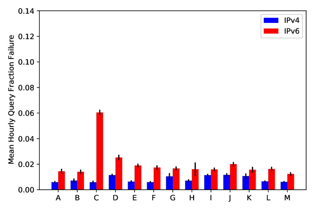
Figure 9 from [Saluja22a], showing fraction of query failures in RIPE Atlas after we remove observers that are islands (unable to reach any of the 13 DNS root identifiers). Blue is IPv4, red is IPv6, with data for each of the 13 DNS root identifiers. We believe this data is a better representation of what people expect to see than Atlas results that include these “broken” observers.

The Domain Name System (DNS) is an essential service for the Internet which maps host names to IP addresses. The DNS Root Sever System operates the top of this namespace. RIPE Atlas observes DNS from more than 11k vantage points (VPs) around the world, reporting the reliability of the DNS Root Server System in DNSmon. DNSmon shows that loss rates for queries to the DNS Root are nearly 10% for IPv6, much higher than the approximately 2% loss seen for IPv4. Although IPv6 is “new,” as an operational protocol available to a third of Internet users, it ought to be just as reliable as IPv4. We examine this difference at a finer granularity by investigating loss at individual VPs. We confirm that specific VPs are the source of this difference and identify two root causes: VP islands with routing problems at the edge which leave them unable to access IPv6 outside their LAN, and VP peninsulas which indicate routing problems in the core of the network. These problems account for most of the loss and nearly all of the difference between IPv4 and IPv6 query loss rates. Islands account for most of the loss (half of IPv4 failures and 5/6ths of IPv6 failures), and we suggest these measurement devices should be filtered out to get a more accurate picture of loss rates. Peninsulas account for the main differences between root identifiers, suggesting routing disagreements root operators need to address. We believe that filtering out both of these known problems provides a better measure of underlying network anomalies and loss and will result in more actionable alerts.

Original data from this paper is available from RIPE Atlas (measurement ids are in the paper). We are publishing new results daily on our website (from the RIPE data).

This work was done while Tarang was on his Summer 2022 undergraduate research internship at USC/ISI, with support from NSF grant 2051101 (PI: Jelena Mirkovich). John Heidemann and Yuri Pradkin’s work is supported by NSF through the EIEIO project (CNS-2007106). We thank Guillermo Baltra for his work on islands and peninsulas, as seen in his arXiv report.

Categories
Papers Publications

new symposium paper “Visualizing Internet Measurements of Covid-19 Work-from-Home” at IEEE Symposium on REU Research in Data Science, Systems, and Security

We published a new paper “Visualizing Internet Measurements of Covid-19 Work-from-Home” by Erica Stutz (Swarthmore College), Yuri Pradkin, Xiao Song, and John Heidemann (USC/ISI) at the Symposium for REU Research in Data Science, Systems, and Security, co-located with IEEE BigData 2021.

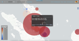
A screenshot from our Covid-WFH website showing an event in Malaysia on 2020-04-02.
A change in Internet use seen in Malaysia on 2020-04-02, present in our Covid-WFH data but discovered through our website.

From the abstract:

The Covid-19 pandemic disrupted the world as businesses and schools shifted to work-from-home (WFH), and comprehensive maps have helped visualize how those policies changed over time and in different places. We recently developed algorithms that infer the onset of WFH based on changes in observed Internet usage. Measurements of WFH are important to evaluate how effectively policies are implemented and followed, or to confirm policies in countries with less transparent journalism.This paper describes a web-based visualization system for measurements of Covid-19-induced WFH. We build on a web-based world map, showing a geographic grid of observations about WFH. We extend typical map interaction (zoom and pan, plus animation over time) with two new forms of pop-up information that allow users to drill-down to investigate our underlying data.We use sparklines to show changes over the first 6 months of 2020 for a given location, supporting identification and navigation to hot spots. Alternatively, users can report particular networks (Internet Service Providers) that show WFH on a given day.We show that these tools help us relate our observations to news reports of Covid-19-induced changes and, in some cases, lockdowns due to other causes. Our visualization is publicly available at https://covid.ant.isi.edu, as is our underlying data.

Datasets from this work will be available from our website and can be seen now at https://covid.ant.isi.edu. We thank NSF grants 2028279 and CNS-2007106 for supporting this work.